Mastering SwiftUI Toolbar Overflow Menus in iOS 27
At WWDC26, SwiftUI received one of its most practical toolbar improvements since the introduction of toolbar customization APIs.
Until now, developers had very limited control over what happened when a toolbar ran out of space. SwiftUI made those decisions automatically, often resulting in important actions disappearing while less important actions remained visible.
The new toolbar APIs introduced in iOS 27, iPadOS 27, macOS 27, and visionOS 27 finally solve this problem by allowing developers to:
- Permanently move secondary actions into an overflow menu
- Control which actions remain visible longer
- Pin important actions to the trailing edge
- Build toolbars that adapt gracefully across screen sizes and window sizes
This article focuses on the new ToolbarOverflowMenu API and how it works together with toolbar placements and visibility priorities.
Apple introduced these APIs as part of a broader effort to improve adaptive interfaces across resizable windows and foldable layouts.
The Problem with Existing Toolbars
Consider a typical mail application toolbar:
- Compose
- Search
- Filter
- Archive
- Delete
- Mark as Read
- Move
- Share
On a large iPad screen everything fits perfectly.
However, on smaller devices or narrow window sizes, the toolbar starts collapsing.
Before iOS 27, SwiftUI decided which actions disappeared first. Developers had little control over that behavior.
This often resulted in awkward situations where destructive actions like Delete remained visible while frequently used actions like Search moved into the overflow menu.
WWDC26 changes that.
Meet ToolbarOverflowMenu
ToolbarOverflowMenu represents a group of actions that should always appear inside the toolbar overflow menu regardless of available space or platform behavior.
.toolbar {
    ToolbarOverflowMenu {
        Button("Archive", systemImage: "archivebox") {
            archive()
        }

        Button("Delete", systemImage: "trash") {
            delete()
        }
    }
}
On iOS and visionOS, these actions automatically appear inside the standard navigation bar overflow menu.
This means developers no longer need to create custom Menu items simply to hide secondary actions.
A Real World Example
Imagine a document editor.
Some actions are critical:
- Save
- Share
- Search
Others are useful but less frequently used:
- Duplicate
- Rename
- Export PDF
- Delete
Using the new API:
struct DocumentView: View {
    var body: some View {
        NavigationStack {
            TextEditor(text: $inputText)
                .toolbar {
                    ToolbarItem(placement: .topBarLeading) {
                        Button("Search", systemImage: "magnifyingglass") {
                            search()
                        }
                    }

                    ToolbarItem(placement: .topBarTrailing) {
                        Button("Save", systemImage: "square.and.arrow.down") {
                            save()
                        }
                    }

                    ToolbarItem(placement: .topBarPinnedTrailing) {
                        Button("Share", systemImage: "square.and.arrow.up") {
                            share()
                        }
                    }

                    ToolbarOverflowMenu {
                        Button("Duplicate", systemImage: "plus.square.on.square") {
                            duplicate()
                        }

                        Button("Rename", systemImage: "pencil") {
                            rename()
                        }

                        Button("Export PDF", systemImage: "doc.richtext") {
                            exportPDF()
                        }

                        Button("Print", systemImage: "printer") {
                            printDocument()
                        }

                        Divider()

                        Button(
                            "Delete",
                            systemImage: "trash",
                            role: .destructive
                        ) {
                            delete()
                        }
                    }
                }
        }
    }
}
The result is a toolbar that remains focused on the actions users perform most often while still providing access to advanced functionality.
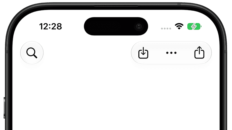
Understanding Toolbar Placements
Toolbar placement determines where an item appears before any overflow behavior occurs.
.topBarLeading
Positions content on the leading side of the navigation bar.
ToolbarItem(placement: .topBarLeading) {
    Button("Search", systemImage: "magnifyingglass") {
    }
}
Typically used for:
- Search
- Back-related actions
- Navigation controls
.topBarTrailing
Places content in the trailing section of the toolbar.
ToolbarItem(placement: .topBarTrailing) {
    Button("Save") {
    }
}
Common use cases include:
- Save
- Edit
- Add
- Filter
.topBarPinnedTrailing
Introduced in WWDC26.
Unlike .topBarTrailing, this placement remains pinned to the trailing edge even while the toolbar reflows due to size changes. Apple specifically designed this placement for actions that should remain consistently accessible.
ToolbarItem(placement: .topBarPinnedTrailing) {
    Button("Share", systemImage: "square.and.arrow.up") {
        share()
    }
}
Great candidates include:
- Share
- Send
- Publish
- Checkout
- Submit
Visibility Priority
The second piece of the puzzle is visibilityPriority(_:).
When toolbar space becomes limited, SwiftUI starts moving items into the overflow menu.
The new modifier allows developers to influence that decision.
ToolbarItem {
    Button("Search") {
    }
}
.visibilityPriority(.high)
Available priorities include:
.low
.automatic
.high
The default value is .automatic.
Example
.toolbar {
    ToolbarItem {
        Button("Search", systemImage: "magnifyingglass") {
        }
    }
    .visibilityPriority(.high)

    ToolbarItem {
        Button("Filter", systemImage: "line.3.horizontal.decrease.circle") {
        }
    }
    .visibilityPriority(.automatic)

    ToolbarItem {
        Button("Archive", systemImage: "archivebox") {
        }
    }
    .visibilityPriority(.low)
}
When the available width shrinks:
- Archive disappears first.
- Filter disappears next.
- Search remains visible longest.
This ordering is exactly what users expect.
What Happens When Priorities Match?
If multiple toolbar items share the same priority, SwiftUI uses placement order to decide which item moves into overflow first.
Items closer to the trailing edge disappear before items located toward the leading edge.
For example:
Search | Filter | ArchiveIf all three use .automatic, SwiftUI will typically move:
Archive → Filter → SearchThis behavior mirrors AppKit's toolbar overflow strategy on macOS.
ToolbarOverflowMenu vs Menu
Developers may wonder why ToolbarOverflowMenu exists when Menu already exists.
The difference is intent.
Menu
Represents an interactive menu that the user explicitly opens.
Menu("More") {
    Button("Delete") { }
}
ToolbarOverflowMenu
Represents toolbar actions that belong to the toolbar's adaptive overflow system.
ToolbarOverflowMenu {
    Button("Delete") { }
}
The system decides how and where to present those actions on each platform.
Platform Behavior
The overflow experience differs slightly depending on the platform.
| Platform | Behavior |
|---|---|
| iOS | Appears inside navigation bar overflow menu |
| iPadOS | Behaves similarly to iOS but adapts to wider layouts |
| macOS | Integrates with native toolbar overflow behavior |
| visionOS | Appears in the ornament toolbar overflow menu |
The API itself remains identical across all platforms.
Design Recommendations
After experimenting with these APIs, a good rule of thumb is:
Keep Visible
- Search
- Share
- Add
- Save
- Compose
Move to Overflow
- Archive
- Delete
- Duplicate
- Rename
- Export
A useful mental model is:
If users perform an action multiple times per session, it probably deserves a visible toolbar button.
When Should You Use ToolbarOverflowMenu?
Use it when:
- Actions are important but not primary.
- The toolbar contains more than four or five actions.
- Your app runs on both iPhone and iPad.
- Your app supports resizable windows on iPad or macOS.
- You want predictable toolbar behavior across devices.
Conclusion
ToolbarOverflowMenu may not be the flashiest API introduced at WWDC26, but it solves a real problem that nearly every productivity app faces.
Combined with visibilityPriority(_:) and topBarPinnedTrailing, SwiftUI toolbars finally become predictable, adaptive, and developer-controlled.
Instead of fighting the system's automatic toolbar behavior, developers can now express intent:
- Keep this action visible.
- Move this action into overflow.
- Pin this action to the trailing edge.
The result is a toolbar that scales naturally from iPhone to Mac while keeping the most important actions exactly where users expect them to be.
For productivity apps, document editors, mail clients, and professional tools, this is one of the most useful SwiftUI additions of WWDC26.
If you have suggestions or opinion, feel free to connect with me on X and send me a DM. If this article helped you, Buy me a coffee.