ContentUnavailableView in SwiftUI - Complete Guide With Examples
SwiftUI has steadily evolved from a declarative UI framework into a platform with thoughtful, production ready UI components. One of the most underrated additions is ContentUnavailableView.
At first glance, it looks simple: a view for empty states.
But in practice, it solves a surprisingly common product problem:
- What should users see when there’s no content?
- How do you communicate loading failures elegantly?
- How do you guide users toward the next action?
- How do you avoid building the same “empty state screen” over and over again?
Before ContentUnavailableView, most SwiftUI apps implemented these screens manually using a VStack, an icon, a title, a subtitle, and maybe a button. Every team reinvented the same UI repeatedly.
Apple noticed this pattern and standardized it.
This article explores ContentUnavailableView in depth:
- What it is
- Why Apple introduced it
- When to use it
- Built-in variants
- Customization techniques
- Accessibility considerations
- Advanced usage patterns
- Common mistakes
- Real-world production examples
What is ContentUnavailableView?
ContentUnavailableView is a SwiftUI view introduced by Apple that provides a standardized interface for displaying empty, unavailable, or failed content states.
It is commonly used when:
- A search returns no results
- A list is empty
- Content failed to load
- A feature has no data yet
- A user hasn’t created anything yet
- Network connectivity issues prevent loading
Instead of building these states manually, SwiftUI provides a native component that automatically follows platform styling and behavior.
The API is intentionally simple.
Basic example:
ContentUnavailableView(
    "No Favorites",
    systemImage: "star.slash",
    description: Text("Items you favorite will appear here.")
)
Output:
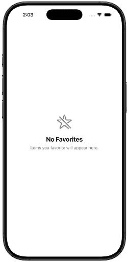
This produces:
- A centered SF Symbol
- A title
- Supporting description text
- Proper spacing
- Platform-consistent typography
- Accessibility support
And importantly:
- It automatically adapts across iPhone, iPad, and Mac
- It respects Dynamic Type
- It aligns visually with Apple system apps
Why ContentUnavailableView Matters
Many developers underestimate empty states.
But empty states are product-critical UI.
A user often sees them:
- on first launch,
- after deleting data,
- during onboarding,
- after failed searches,
- during offline usage.
Poor empty states create confusion.
Good empty states:
- explain what happened,
- reduce friction,
- guide user behavior,
- improve perceived polish.
Apple’s Human Interface Guidelines strongly emphasize clarity during moments where no content exists.
ContentUnavailableView helps achieve that consistency.
Before ContentUnavailableView
Before iOS 17, most SwiftUI code looked something like this:
VStack(spacing: 16) {
    Image(systemName: "tray")
        .font(.system(size: 50))

    Text("No Documents")
        .font(.title2)

    Text("Your documents will appear here.")
        .foregroundStyle(.secondary)
}
.multilineTextAlignment(.center)
.padding()
Output:
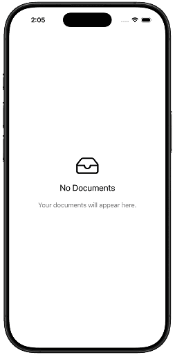
This works.
But every app implemented:
- slightly different spacing,
- different font hierarchy,
- inconsistent alignment,
- inconsistent accessibility behavior.
The result:
- duplicated UI code,
- inconsistent UX,
- harder maintenance.
ContentUnavailableView solves this by providing a canonical system component.
Availability
ContentUnavailableView is available on:
- iOS 17+
- iPadOS 17+
- macOS 14+
- tvOS 17+
- watchOS 10+
Because it is relatively new, many production apps still support earlier OS versions.
That means you may still need fallback implementations for older deployments.
Example:
if #available(iOS 17, *) {
    ContentUnavailableView(
        "No Notes",
        systemImage: "note.text"
    )
} else {
    LegacyEmptyStateView()
}
Basic Syntax
The most common initializer is:
ContentUnavailableView(
    "No Messages",
    systemImage: "message",
    description: Text("New messages will appear here.")
)
Output:
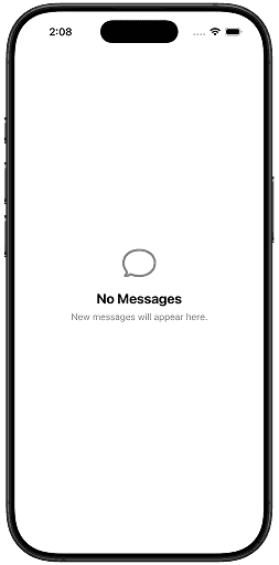
Parameters:
- title
- SF Symbol image
- optional description
SwiftUI handles:
- layout,
- typography,
- spacing,
- accessibility.
Understanding the Structure
Conceptually, ContentUnavailableView contains:
Icon
Title
Description
Optional Actions
This structure matters because it encourages good UX design.
Apple intentionally limits complexity here.
An empty state should communicate:
- What happened
- Why it happened
- What users can do next
Not become a fully custom screen full of unrelated UI.
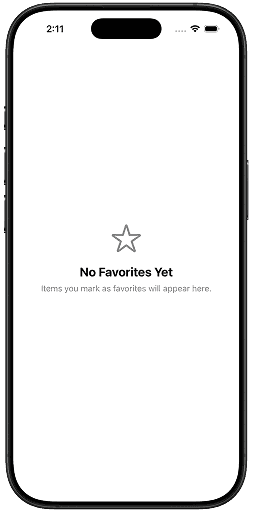
Example: Empty Favorites Screen
struct FavoritesView: View {
    let favorites: [String] = []

    var body: some View {
        if favorites.isEmpty {
            ContentUnavailableView(
                "No Favorites Yet",
                systemImage: "star",
                description: Text(
                    "Items you mark as favorites will appear here."
                )
            )
        } else {
            List(favorites, id: \.self) { item in
                Text(item)
            }
        }
    }
}
Output:
Why This is Better Than Manual UI
This gives you:
- platform consistency,
- reduced boilerplate,
- better accessibility defaults,
- easier maintenance.
And the code communicates intent immediately.
That matters in large SwiftUI codebases.
Built-in Search Empty State
One of the best features is the built-in search initializer.
ContentUnavailableView.searchThis produces Apple’s standard “No Results” search experience.
Example:
struct SearchView: View {
    @State private var query = ""

    var filteredItems: [String] {
        items.filter {
            query.isEmpty || $0.localizedCaseInsensitiveContains(query)
        }
    }

    let items = [
        "Swift",
        "SwiftUI",
        "UIKit",
        "Combine"
    ]

    var body: some View {
        NavigationStack {
            Group {
                if filteredItems.isEmpty {
                    ContentUnavailableView.search
                } else {
                    List(filteredItems, id: \.self) { item in
                        Text(item)
                    }
                }
            }
            .searchable(text: $query)
            .navigationTitle("Frameworks")
        }
    }
}
Output:
Why the Search Variant Matters
This is a subtle but important API.
Most apps build search empty states inconsistently.
Apple now provides:
- standardized wording,
- standardized visuals,
- platform familiarity.
Users instantly understand the UI because system apps behave similarly.
This is one of SwiftUI’s biggest philosophical strengths:
common UI patterns become declarative primitives.
Custom Search Empty State
You can also customize search-specific states.
ContentUnavailableView {
    Label("No Results", systemImage: "magnifyingglass")
} description: {
    Text("We couldn't find anything matching your search.")
} actions: {
    Button("Clear Search") {
        query = ""
    }
}
Output:
Adding Actions
Actions are where ContentUnavailableView becomes genuinely useful.
Empty states should often guide recovery.
Example:
ContentUnavailableView {
    Label("No Downloads", systemImage: "arrow.down.circle")
} description: {
    Text("Downloaded files will appear here.")
} actions: {
    Button("Browse Files") {
        openFileBrowser()
    }
}
Output:
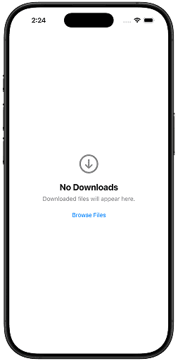
This transforms the UI from passive information into actionable UX.
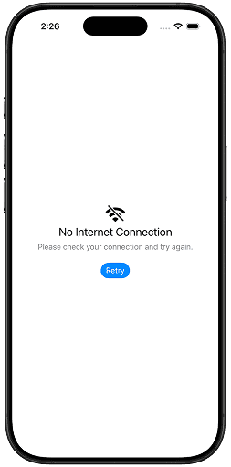
Full Custom Initializer
The most flexible initializer uses view builders.
ContentUnavailableView {
    VStack {
        Image(systemName: "wifi.slash")
            .font(.largeTitle)

        Text("No Internet Connection")
            .font(.title2)
    }
} description: {
    Text("Please check your connection and try again.")
} actions: {
    Button("Retry") {
        retryRequest()
    }
    .buttonStyle(.borderedProminent)
}
Output:
Why View Builders Matter
This allows:
- custom layouts,
- custom typography,
- richer visuals,
- branded empty states.
But there’s an important design consideration.
Over-customizing empty states often hurts consistency.
Many apps misuse empty states as miniature marketing pages.
Apple’s API nudges developers toward restraint.
That’s a good thing.
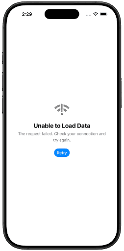
Real-World Production Examples
1. Failed Network Request
struct ErrorView: View {
    var retry: () -> Void

    var body: some View {
        ContentUnavailableView {
            Label(
                "Unable to Load Data",
                systemImage: "wifi.exclamationmark"
            )
        } description: {
            Text(
                "The request failed. Check your connection and try again."
            )
        } actions: {
            Button("Retry") {
                retry()
            }
            .buttonStyle(.borderedProminent)
        }
    }
}
Output:
2. First-Time User Experience
ContentUnavailableView {
    Label("No Projects Yet", systemImage: "folder")
} description: {
    Text("Create your first project to get started.")
} actions: {
    Button("Create Project") {
        createProject()
    }
}
Output:
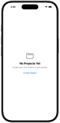
This pattern is extremely common in productivity apps.
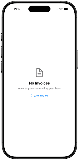
3. Empty Invoice Screen
ContentUnavailableView {
    Label("No Invoices", systemImage: "doc.text")
} description: {
    Text("Invoices you create will appear here.")
} actions: {
    Button("Create Invoice") {
        showInvoiceCreator()
    }
}
Output:
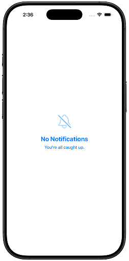
Styling ContentUnavailableView
You generally do not style this view aggressively.
That’s intentional.
Still, SwiftUI allows some customization.
Example:
ContentUnavailableView(
    "No Notifications",
    systemImage: "bell.slash",
    description: Text("You're all caught up.")
)
.symbolRenderingMode(.hierarchical)
.foregroundStyle(.blue)
Output:
Using SF Symbols Effectively
The SF Symbol you choose matters significantly.
Good symbols:
- communicate state immediately,
- reinforce meaning,
- reduce cognitive load.
Bad symbols create ambiguity.
Examples:
wifi.slashtraymagnifyingglassdoc.textfolder.badge.plus
Apple’s own apps heavily rely on semantic SF Symbols.
Accessibility Considerations
One major advantage of ContentUnavailableView is accessibility consistency.
It automatically supports:
- Dynamic Type
- VoiceOver
- semantic grouping
- proper spacing
- readable layouts
However, developers can still make mistakes.
Common Accessibility Mistake
Avoid using only imagery without clear text.
Bad:
ContentUnavailableView {
    Image(systemName: "wifi.slash")
}
Good:
ContentUnavailableView(
    "No Internet",
    systemImage: "wifi.slash",
    description: Text("Please reconnect and try again.")
)
Advanced Pattern: State-Driven Empty Views
A powerful architecture pattern is combining ContentUnavailableView with enum-based view states.
Example:
enum LoadingState {
    case loading
    case loaded([String])
    case empty
    case failed
}
Then:
switch state {
case .loading:
    ProgressView()

case .loaded(let items):
    List(items, id: \.self) { item in
        Text(item)
    }

case .empty:
    ContentUnavailableView(
        "No Items",
        systemImage: "tray"
    )

case .failed:
    ContentUnavailableView(
        "Something Went Wrong",
        systemImage: "exclamationmark.triangle"
    )
}
This scales exceptionally well in production SwiftUI apps.
Common Mistakes
1. Overbuilding Empty States
Some developers create overly complex empty states with:
- multiple cards,
- animations,
- giant illustrations,
- unrelated controls.
- Usually unnecessary.
Empty states should be lightweight.
2. Using Generic Messages
Bad:
No DataGood:
No Saved Articles
Articles you bookmark will appear here.
Specificity improves usability.
3. Missing Recovery Actions
If users can fix the situation, provide actions.
Examples:
- Retry
- Create
- Refresh
- Clear Search
4. Using Empty States During Loading
A loading state is not an empty state.
Do not show:
ContentUnavailableView("No Data")while a request is still loading.
Use:
ProgressView- skeleton loaders
- loading placeholders
instead.
Comparing ContentUnavailableView vs Custom Empty Views
| Feature | ContentUnavailableView |
Custom View |
|---|---|---|
| Fast to implement | Yes | No |
| Consistent with iOS | Yes | Depends |
| Accessibility defaults | Excellent | Manual |
| Fully customizable | Limited | Yes |
| Best for common empty states | Excellent | Sometimes excessive |
In most apps:
- start with
ContentUnavailableView, - move to custom views only when genuinely necessary.
When You Should NOT Use It
Avoid using ContentUnavailableView when:
- the screen is highly branded,
- the state requires rich onboarding,
- the screen needs complex illustrations,
- the state is core product marketing.
Example:
- onboarding walkthroughs,
- paywalls,
- interactive tutorials.
Those deserve dedicated custom UI.
Performance Considerations
ContentUnavailableView is lightweight.
It’s just another SwiftUI view hierarchy.
In practice:
- rendering cost is negligible,
- layout complexity is minimal,
- performance impact is insignificant.
The real value is architectural clarity.
Apple’s Design Philosophy Here
This API reflects a broader SwiftUI trend.
Apple increasingly converts common UI patterns into standardized declarative components:
ProgressViewShareLinkNavigationSplitViewContentUnavailableView
This reduces:
- duplicated UI code,
- inconsistent UX,
- reinvention of standard interfaces.
And honestly, this is one of SwiftUI’s strongest ideas.
Not every UI problem needs a custom solution.
Final Thoughts
ContentUnavailableView may look like a small API addition, but it solves a real design and engineering problem elegantly.
It gives SwiftUI developers:
- cleaner code,
- better accessibility,
- platform consistency,
- faster development,
- improved UX.
Most importantly, it encourages developers to treat empty states as first-class product experiences instead of forgotten placeholders.
That mindset matters.
Users spend more time in edge cases than developers expect:
- no internet,
- no results,
- no data,
- first launch,
- failed syncs.
Great apps handle those moments gracefully.
And in SwiftUI, ContentUnavailableView is now the standard way to do exactly that.
If you have suggestions, feel free to connect with me on X and send me a DM. If this article helped you, Buy me a coffee.